Friday, December 21, 2012

Starry Night

I saw this lesson in Arts and Activities years ago.  I do some version of it every year with Kindergarten.  We look at van Gogh's "Starry Night" and name what we see.  During the first class we Glue shapes for the houses, moon, and the cypress tree.  The cypress is cut from a 6x9 rectangle of green paper.  I show kids how to draw a tall triangle, but cut a crazy line to give the tree a wild texture like van Gogh's tree.  If time allows they can draw details with marker.
 
 
Jordan


Brodie
Week two, we made our stars shine by adding them in glitter.  Then we painted the wind!

Triangle Tree

Here is an easy one shot lesson plan that makes me and the kids happy.  They love to paint, I love the whimsical shapes and lines they create.  Today's class is using a magenta background and a chartreuse colored tree for even more whimsy!
Materials: 9x12 background paper, green square or rectangle (6x6 or 6x9), brown scrap for trunk, white paint and q-tip for painting.
I show students how to draw an X on their green paper: from corner to corner.  When you cut it out, you get four triangles.  A little geometry never hurt anyone.  As we stack them into a tree and glue them down, we do some trimming so the top is smaller than the bottom.


Immy
This tree took two and a half squares.  It is ready to paint.


When others look at our paint they will see snow.  But the artist who paints the picture is thinking of interesting lines to show a gust of wind, snow on the branches, piles of snow on the ground.   

Friday, September 21, 2012

Impressionism

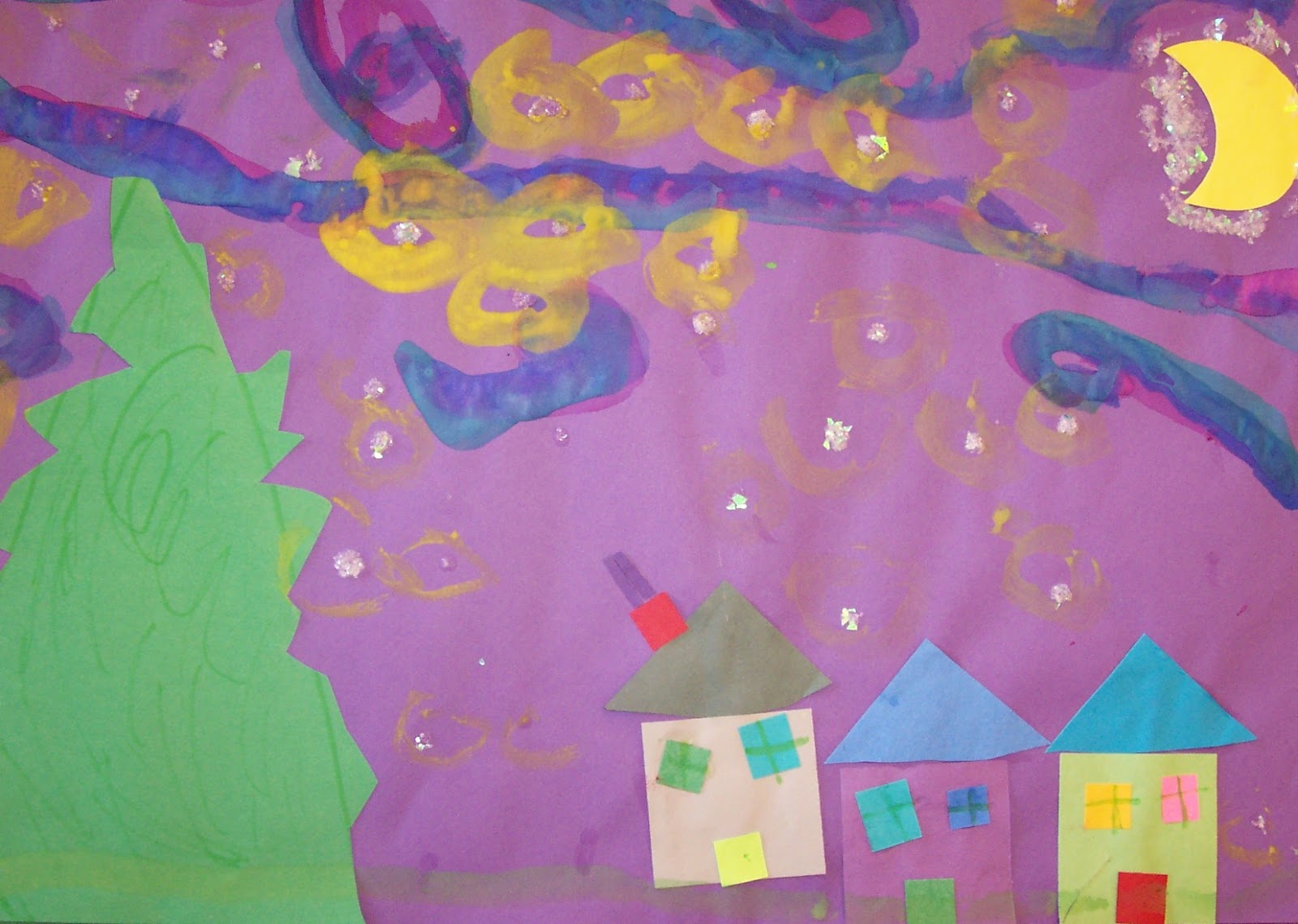
In second grade, I teach the major styles of art: Realism, Abstract and Impressionism. 
One of my proudest teacher moments came years ago, when I walked past a classroom and heard the teacher starting to teach abstract words.  I noticed the word abstract written on the board, so I hung around to hear more.  Several students related what they had learned about abstract art in my class.  
This is my favorite way to teach Impressionism.


Students read the Mike Venezia book on Monet.  Since the major purpose of impressionism is to show how something looks with the light on it, we color in a heart using impressionist "brush strokes" with oil pastels.  Students choose one color for the entire heart.  They use light colors on one half of the heart and dark colors on the other half.  I show students how to check the color wheel to find the compliment of their chosen heart color.  To keep their colors bright, Impressionists used compliments (opposites on the color wheel) side by side, but usually avoided mixing them. 


To finish, I let students use paper edgers (we call them "crazy cuts") to trim a paper frame and decorate with scrap paper.  The results are not perfect, but charmingly child-like.  They make a wonderfully colorful display.


Tuesday, August 28, 2012

Painting to Music

Of course painting to music starts with a lesson on Kandinsky.  I tell my students how Kandinsky liked to paint to music.  He said when he saw a painting he could hear music in it.  I played various types of music and students made one painting per song.  I encouraged them to stop and listen for inspiration, or to let the music move their paintbrush hand.  Can you hear colors too? 


Q-tip Winter Tree

Kindergartners LOVE to paint.  I like to keep it simple so clean up is not overwhelming.  So I often use a Q-tip for the paint instead of a brush.  This project reviews rectangle and triangle.  I tell my students that the person who looks at their picture should see snow, but the artist who paints it is CREATING LINES.  According to basic geometry, a line starts with a dot that moves.  And q-tips  make perfect little dots.  Now move the q-tip and create a line!


Paul Klee Hearts

 
After my fourth grade students look at Paul Klee's colorful abstract art work, I show them how to use primary tempera paints (magenta, yellow and turquoise) plus white to get any complicated colors.  I find if I don't give them white the colors get very deep and dark. 
While they already know red and yellow make orange, a little more red makes yellow-orange.  We use egg cartons to mix the colors in.  So one egg cup ean mix three or more colors.  The more colors they make in each cup the more complicated the colors get.  Sharing colors is a great time saver.  It is soon obvious to everyone that analagous colors create brights, while opposites create neutrals.  I wish I had learned this in elementary school instead of college.  Painting 101 would have been much easier.


Thursday, June 14, 2012

Koi Fish

The inspiration for this painting came from the artist Aleah Koury "Floating Motion".  The students work came out great.  Their biggest challenge was drawing the koi fish to look like they were moving.  I showed them how I started with a slight S curve in pencil.  We used contrasting color outlines for the fish and the water lilies.  We colored in the fish with warm color crayons.  Then we went over the fish bodies with white crayon to make sure the water colors would not cover them.  Also in crayon, a white spiral or three.


Last we painted the water and the lillies.